Most of Your Visitors Are on a Phone. Is Your Site Built for One?
Most people who visit your website are holding a phone, standing up, half-distracted, with one thumb available. Many business websites are still designed on a large monitor by someone sitting down with a mouse. The gap between those two situations is where enquiries go to die.
Shrinking is not designing
A responsive site rearranges itself. A squeezed site keeps the desktop layout and makes everything smaller. The second one technically "works on mobile" and is miserable to use: text you must pinch to read, buttons too small to hit, tables that slide off the edge.
Five tests, done with your own thumb
- Can you read body text without zooming? If not, the text is too small. There is no other diagnosis.
- Can you hit every button first time? Tap targets need to be roughly the size of a fingertip. Anything smaller is a coin toss.
- Does the page scroll sideways? It should never. Horizontal scroll means something is wider than the screen, and it makes a site feel broken even when it is not.
- Is your phone number tappable? On a phone, a number that does not dial when tapped is a number nobody calls.
- How far is it to the first way of contacting you? If a visitor must scroll through three screens to find a button, most of them will not.
The honest version of this test: hand your phone to someone who has never seen the site and ask them to contact you. Say nothing. Watch where they hesitate. That pause is your redesign brief.
The mistakes that cost the most
Menus that hide everything
A hamburger menu is fine. A hamburger menu that hides your only call to action is not. The primary action should be visible without opening anything.
Forms with too many fields
Every field is a small tax paid with a thumb on a moving train. Name, contact, one sentence about what they need. You can ask the rest in the conversation that follows.
Pop-ups on arrival
On a large screen a pop-up is an annoyance. On a phone it covers the entire page, and the close button is often the smallest thing on it.
Text in images
It cannot be resized, cannot be selected, cannot be read by search engines, and turns to mush on a small screen.
What to fix first
In order: readable text, tappable contact, no sideways scroll, contact option visible early. Those four cover most of the gap, and none of them require a redesign.
If it does need rebuilding, ours are mobile-first by default and start at R2,500 once-off.
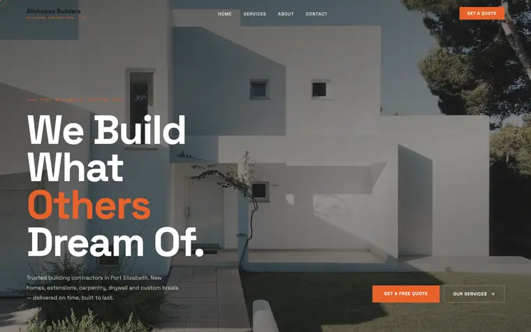
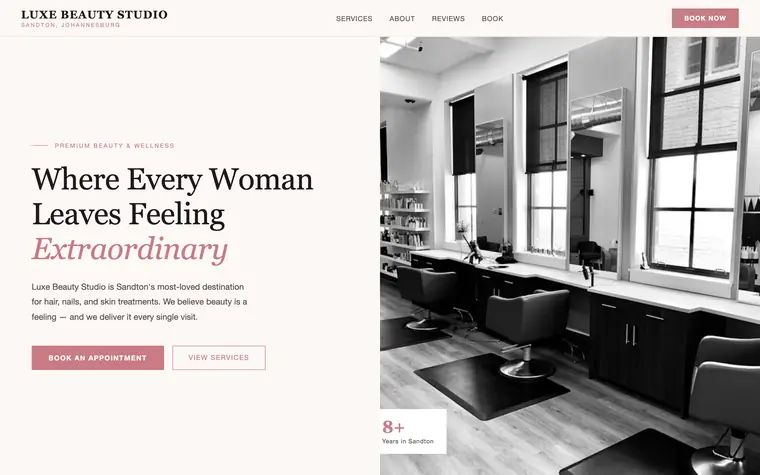
Recent work
Every one of these was designed in full before the business paid anything.


Related reading
- How Fast Should a Website Load? Real Targets
- Why Your Website Isn't Getting Enquiries: 7 Leaks
- What Pages Does Your Website Actually Need?
- What a Bad Website Really Costs Your Business
Want a site that works properly on a phone?
We build it first — you only pay when you love it. Every quote is tailored to your project.
⚡ Get My Instant QuoteBuilding something bigger — a mobile app, a CRM or custom software? Those are scoped and quoted per project.
Frequently asked questions
What does mobile-first design actually mean?
It means the phone layout is designed first and the larger screens adapt from it, rather than a desktop layout being shrunk down. The difference shows in text size, button size and how early the contact option appears.
How big should buttons be on a mobile website?
Roughly the size of a fingertip — about 44 pixels square is the widely used minimum. Anything smaller turns tapping into guesswork, particularly for one-handed use.
Should my website have a pop-up on mobile?
Generally no. On a small screen a pop-up covers the whole page, and the close control is often the smallest element on it, which makes it far more likely to lose the visitor than convert one.
About the author. Andy Njiokwuemegi is the founder of Andritha Online (Pty) Ltd (reg. 2026/735468/07), which designs and builds websites, online stores, mobile apps and custom software for businesses in South Africa and abroad. Every website is built in full before the client pays.